General Rules
- "Radiant" refers to the family of Radiant based level editing tools.
- "GtkRadiant" refers to the main branch of the Radiant family of level editing tools.
- Take note of the casing used with GtkRadiant. It should not appear as "GTKRadiant".
- In all logos the word "Radiant" is displayed, but the editor is generally referred to as "GtkRadiant".
- "GtkRadiant" should never be abbreviated as "Gtk" or "GTK". This can lead to confusion with the GIMP Toolkit (GTK) project which GtkRadiant makes use of.
- When scaling the logo and text, ensure that you maintain a consistant stroke around all elements.
- Maintain a healthy level of white space between the logo and other elements. The logo should not overlap or be covered by other elements.
Logos
Our standard v3.0 GtkRadiant logo. Aside from a few exceptions, this is the default logo that should be used. It features a better defined shape, and sharp edges and corners on the text. The type face is scaled at 256pt for the main text, 64pt for the subtext, all with a 10pt stroke.
Typography
GtkRadiant Website Colour Swatches
| Pure Black | |||
| Stoke edges, major grid | HEX: #000000 | RGB: 0,0,0 | HSB: 0,4,5 |
| Header Gray | |||
| Gray text colour for headers | HEX: #333333 | RGB: 51,51,51 | HSB: 0,0,20 |
| Gray Text | |||
| Standard gray text colour | HEX: #444444 | RGB: 68,68,68 | HSB: 0,0,27 |
| Radiant Grid Dark Blue | |||
| Grid background | HEX: #0E132A | RGB: 14,19,42 | HSB: 229,67,16 |
| Radiant Grid Light Blue | |||
| Grid lines | HEX: #151C3E | RGB: 21,28,62 | HSB: 230,66,24 |
| Radiant Background Blue | |||
| Link box background | HEX: #29387B | RGB: 41,56,123 | HSB: 229,67,48 |
| Radiant Background Glow | |||
| Link box hover, text links on light backgrounds | HEX: #334499 | RGB: 51,68,153 | HSB: 230,67,60 |
| Link Text | |||
| Text links on dark backgrounds | HEX: #7788DD | RGB: 119,136,221 | HSB: 230,46,87 |
| Radiant Logo Text | |||
| Radiant logo, text on dark backgrounds | HEX: #E1E3EC | RGB: 225,227,236 | HSB: 229,5,93 |
| Pure White | |||
| Page background | HEX: #FFFFFF | RGB: 255,255,255 | HSB: 0,0,100 |
Legacy References
The GtkRadiant logos, icons and website has had a lot of changes in its long history. This section just highlights some of the evolutions in its design.

The old Q3Radiant program icon, highly pixelated with a Quake 3 Arena logo. It might look a little better if you squint your eyes.

The QeRadiant logo from the Q3Radiant.com website in 1999. This is probably the first appearance of the Radiant Sun logo, although very different.

This was the page banner from the website, redesigned in 2002. The v1 logo was a small image that did not scale well. The points on the sun logo were sharply angled. The familiar blue, white and black colour scheme was established. The current website tries to stay true to this original theme, keeping the radiating lines, circles, and a grid with vectors drawn.

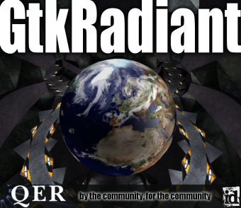
The GtkRadiant splash screen featuring SPoG's Q3 map, "Lonely Planet". This image greeted level designers everytime they felt like being a little creative.

An attempt at a logo redesign for GtkRadiant. It didn't see much use.
This is the redesigned v2 logo. It was designed to be an approximation of the v1 logo, but with better text placement, rounded points, and as a vector image so that it could be infinitely scaled.
Finally, this is our current v3 logo. It differs from the v2 logo in that the stroke around the text now has sharper corners for a more solid outline.